Reflective Memorandum
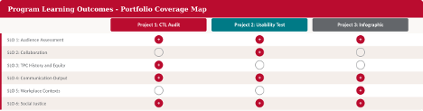
The three projects in this portfolio represent the arc of my academic learning and professional growth in the Graduate Certificate in Technical and Professional Communication (GCERT T&PC) program at the University of New Mexico. Taken together, they demonstrate my development as a practitioner who creates and designs communication outputs that are audience-centered, theoretically grounded, ethically responsible, and oriented toward social equity. In this memorandum, I reflect on each project in turn, connect them to the six program learning outcomes (SLOs), and explain how this body of work has prepared me for professional and scholarly practice in the TPC field.
I. User-centered Audit: Findings and Recommendations (ENGL 502)
The first portfolio item is a user-centered audit of the University of New Mexico’s Center for Teaching and Learning (CTL) website, produced for ENGL 502: User-Centered Design and Usability. The audit used a structured evaluation method and yielded a prioritized action plan. It identified high-priority issues in navigation clarity, search functionality, and mobile accessibility, along with medium- and low-priority improvements in content freshness and visual design. The deliverable was a professional presentation addressed directly to the CTL organization.
This project engages most directly with SLO 1 and SLO 4. Drawing on Jakob Nielsen’s evaluation framework, I carefully and systematically assessed a real organization’s website against key usability principles — learnability, efficiency, memorability, error prevention, and satisfaction — and translated those findings into clear, actionable recommendations. The audit required me to understand CTL’s diverse user base, including undergraduate students looking for tutoring, graduate students and instructors seeking professional development, and administrators managing course accessibility. By differentiating recommendations based on the user role and urgency, I practiced what Redish (2012) calls “task-oriented” content design: an approach that focuses on what users want to do—not on how the organization likes to show itself.
The audit also speaks to SLO 3 and SLO 6. The CTL website serves a diverse population that includes multilingual learners, first-generation students, and students with disabilities, groups who can only access institutional services if those services are easy to find and understand. Recommending changes like improved mobile responsiveness, clearer visual hierarchy, and higher contrast ratios was not merely about style and good design; it was about fairness—an act of equity advocacy, recognizing that how information is organized can either open or block access for historically underserved users (Kimball & Hawkins, 2007).
| Key Insight: A usability audit is never a neutral technical exercise — it has political and ethical impact, showing what a system is meant for and who it is meant to serve. |
II. Usability Test Plan, Test, and Report: Microsoft Word (ENGL 512)
The second portfolio item is a complete usability test package produced for ENGL 512: User-Centered Design and Usability. The project includes a detailed test plan, report on the testing process, participant profiles, task analysis, data tables, severity ratings, and actionable recommendations for improving Microsoft Word 365. Three participants with varying skill levels — recruited from UNM’s Center for English Language and American Culture (CELAC) — completed six formatting and collaboration tasks in a guided, in-person session at Zimmerman Library’s Graduate Commons, using a think-aloud protocol.
This project is the most methodologically detailed piece in the portfolio and shows competency across SLO 1, SLO 2, and SLO 4. The theoretical framing for this project drew heavily on Rubin and Chisnell’s Handbook of Usability Testing, particularly their chapters on task construction, formative test design, and triangulated analysis. Donald Norman’s The Design of Everyday Things provided the diagnostic vocabulary to explain user behavior: the concept of the “gulf of execution” explained why participants had struggled finding Track Changes, and “signifiers” clarified why novice users couldn’t see the table customization tools (Norman, 2013).
The selection of CELAC students as participants was an intentional equity decision that connects this project to SLO 6. These international students are the kind of user usually excluded from software usability research, even though they have to use institutional technology with the most limited scaffolding. The recommendations — including helpful prompts for heading styles, simplified table UI, and guided instructions for Track Changes — support design that meets users where they are. This is precisely the kind of advocacy that Walton, Moore, and Jones (2019) call for in their social justice-oriented TPC framework.
| Key Insight: Focusing on international and multilingual users in a Microsoft Word usability study shows that Word assumes its users are already familiar with Western, English-language document conventions, which isn’t true for everyone. |
III. CTL Quick Start Infographic — Visual Rhetoric Final Project (ENGL 512)
The third portfolio item is a redesigned one-page infographic for UNM’s Center for Teaching and Learning, produced as the visual rhetoric final project for ENGL 512. The infographic, “CTL Quick Start: A User-Centered Guide for Students and Instructors,” was designed to replace CTL’s long, text-heavy web pages with a clear, scannable, action-oriented document focused on two main user paths: students looking for immediate help, and instructors working to improve course accessibility.
This project demonstrates competency in SLO 4 and SLO 6 with particular clarity. Every design choice was made to reduce the cognitive load for the reader. Kimball and Hawkins’ (2007) principles of chunking and typographic hierarchy guided the use of bold headers and task-flow structure. The justification to replace ambiguous or decorative imagery with literal, labeled pictograms came from Chandler’s (2000) semiotic framework — a principle especially critical for multilingual users. Kenney’s (2002) visual communication theory supported a persistent call-to-action strategy that frames CTL as approachable and action-oriented.
The infographic also connects to SLO 1 and SLO 5. Designing it demanded careful focus on two different audiences, each with distinct needs, varying familiarity with the institution, and different ways of using CTL’s services. Even though this was just one assignment, checking my content against CTL’s existing service pages felt like doing real communication work for a community, and that kind of work defines TPC practice in nonprofit and higher education contexts.
| Key Insight: The infographic does rhetorical work — it not only informs but persuades users that support is accessible and immediately available, demonstrating that document design is always also an act of advocacy. |
IV. Synthesis: Learning, Workplace Readiness, and TPC Practice
Across these three projects, several threads of growth are clearly visible. The first shows a stronger commitment to audience analysis as an ethical, not merely strategic, practice. Whether auditing a website, running a usability test, or designing an infographic, I have learned to ask not just “who is the user?” but “who has historically been excluded from this design, and why?” The second thread is strong methods: the usability test showed that good TPC practice requires careful data collection, transparent analysis, and the intellectual honesty to let evidence challenge initial assumptions. The third thread is design literacy: across all three projects, I have developed a basic understanding of visual rhetoric, document design, and information architecture which helps me explain and support my design choices clearly.
These competencies are directly applicable to workplace and industry contexts. Whether in UX research, technical writing, content strategy, accessibility consulting, or instructional design, TPC professionals are called upon to advocate for users, communicate complex information clearly, and design outputs that are inclusive, usable, and action-oriented. The GCERT program has prepared me to enter that field not as a practitioner who knows the tools, but as one who understands the stakes.
References
Chandler, D. (2000). Semiotics for beginners. University of Wales.
Kenney, K. (2002). Building visual communication theory by borrowing from rhetoric. Journal of Visual Literacy, 22(1), 53-80. https://doi.org/10.1080/23796529.2002.11674581
Kimball, M. A., & Hawkins, A. R. (2007). Document design: A guide for technical communicators. Bedford/St. Martin’s.
Norman, D. A. (2013). The design of everyday things (Rev. and expanded ed.). Basic Books.
Redish, J. (2012). Letting go of the words: Writing web content that works (2nd ed.). Morgan Kaufmann.
Rubin, J., & Chisnell, D. (2008). Handbook of usability testing: How to plan, design, and conduct effective tests (2nd ed.). Wiley.
Walton, R., Moore, K. R., & Jones, N. N. (2019). Technical communication after the social justice turn: Building coalitions for action. Routledge.